You walk into your living room and pause. The layout works. The furniture is fine. But the color? It’s either playing it too safe,or doing a little too much. You want something that feels right. Something that brings the space to life, sets the mood, and makes everything feel just a little more pulled together.
That’s the power of a great color combination.
Whether you’re craving something bold and modern, soft and soothing, or classic with a twist, the right palette can transform the whole energy of your room. And it’s not just about walls it’s your sofa, your rug, your art, your accents. It’s how the colors talk to each other that really makes the magic.
Coming up: 30 living room color combinations that range from daring to timeless. These pairings will help you reimagine your space,bringing warmth, depth, and just the right amount of “wow” to the heart of your home.
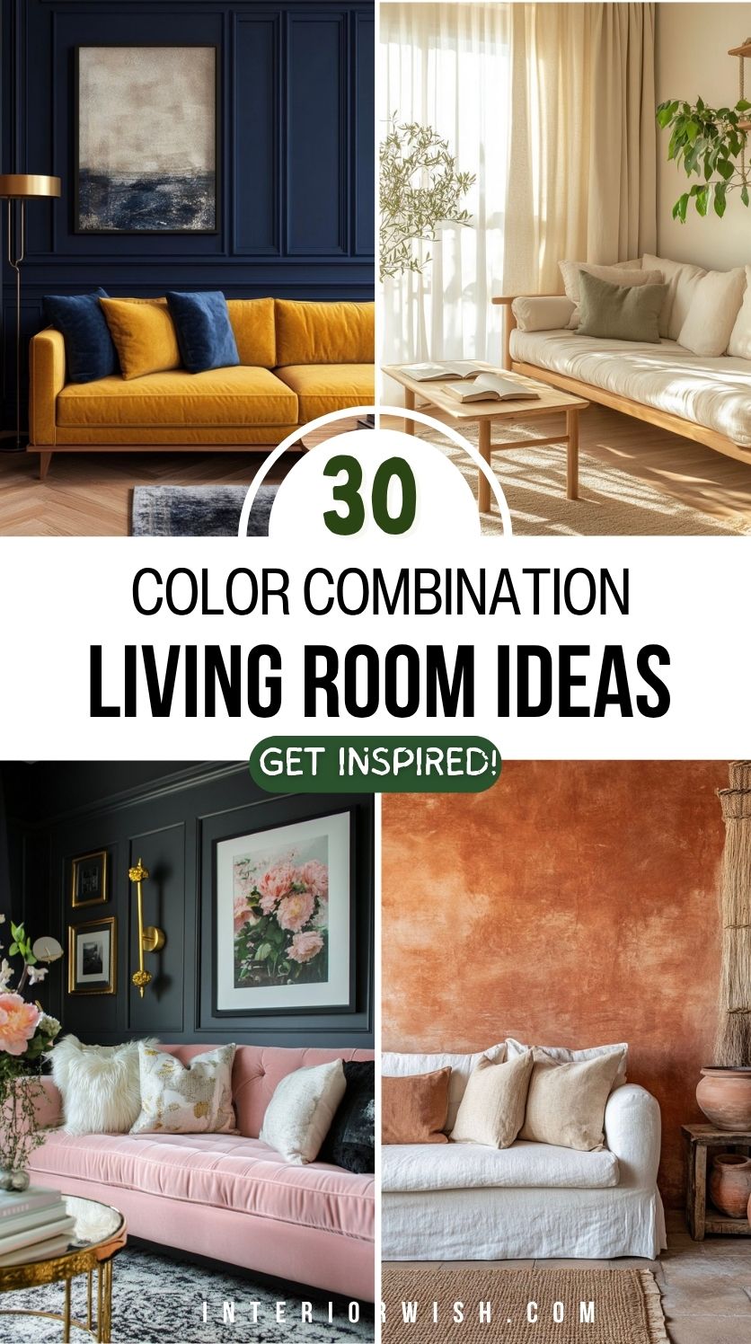
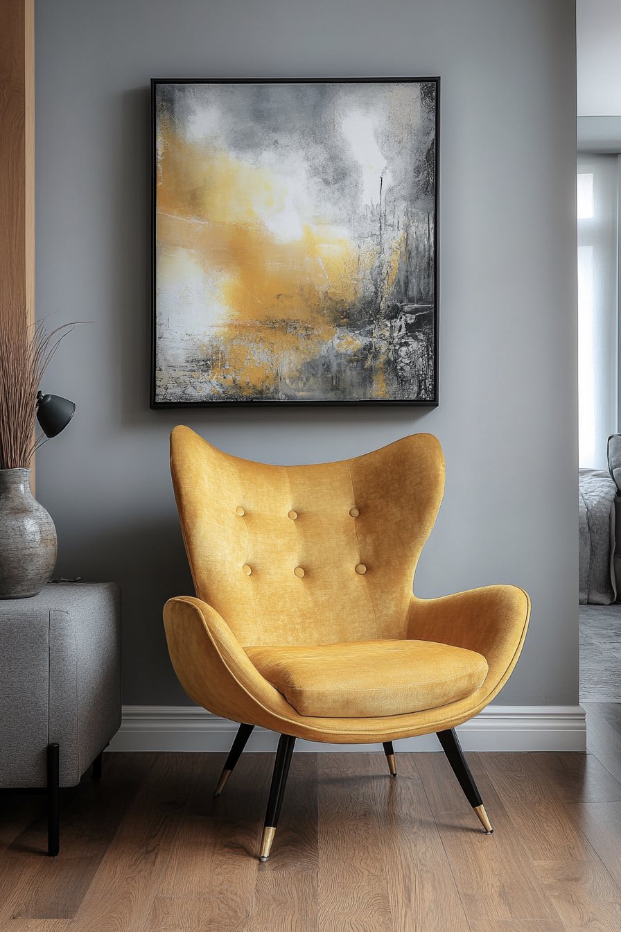
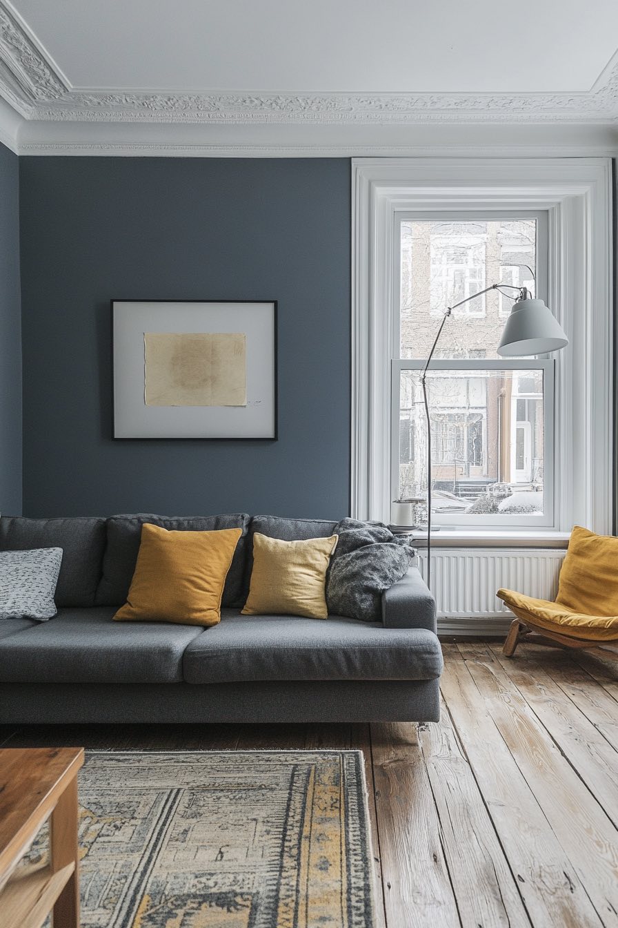
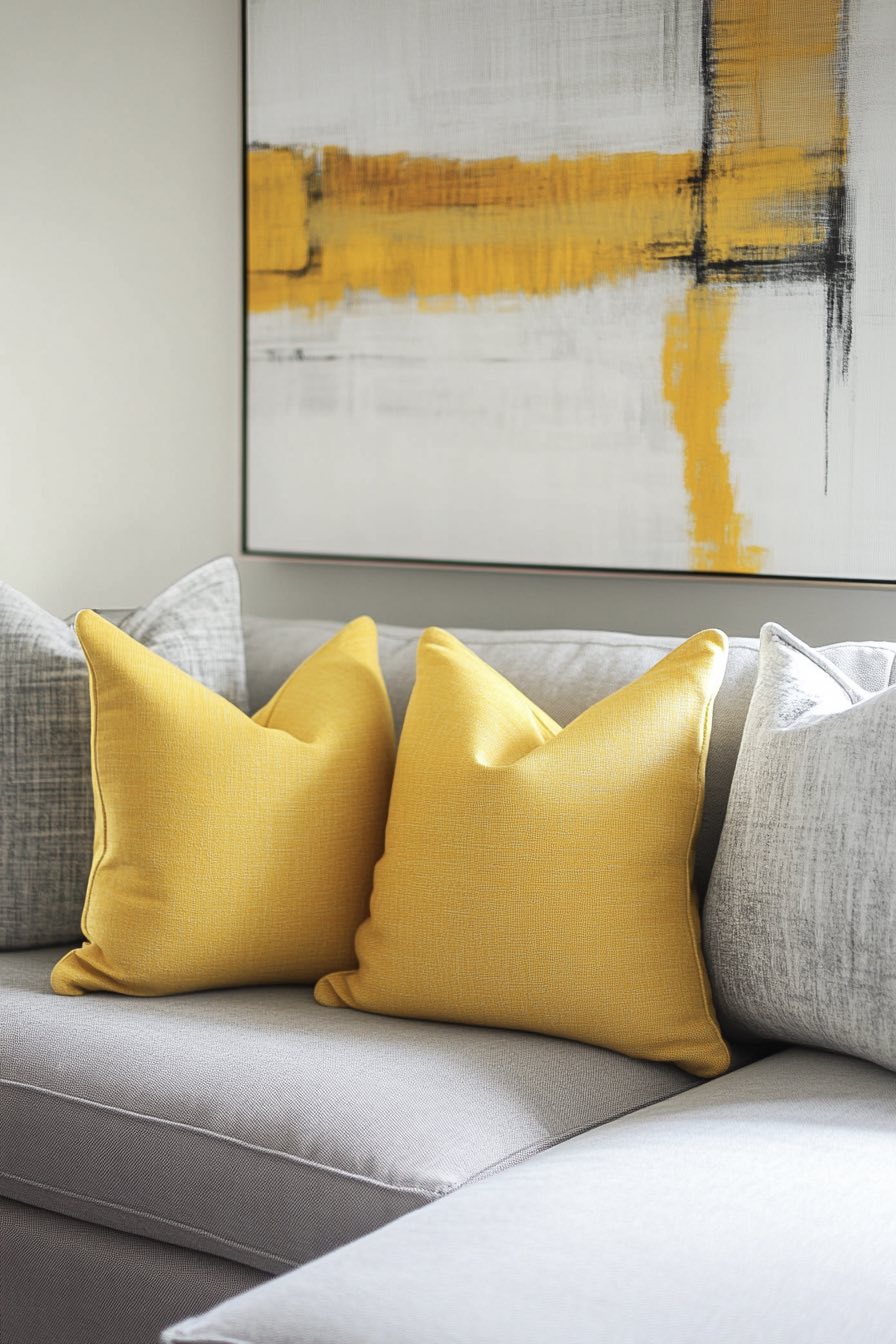
1. Navy Blue and Mustard Yellow
There’s something so sophisticated about the way deep navy wraps around this space, creating an almost cocoon-like feeling that makes you want to curl up with a good book. The mustard yellow accents pop like little bursts of sunshine, whether it’s those plush throw pillows or that gorgeous vintage-inspired armchair that looks like it has stories to tell.
What I love most is how this combo feels both grounded and energetic at the same time. The navy keeps things from feeling too bright or overwhelming, while that golden mustard adds just enough warmth to make the space feel inviting rather than formal.
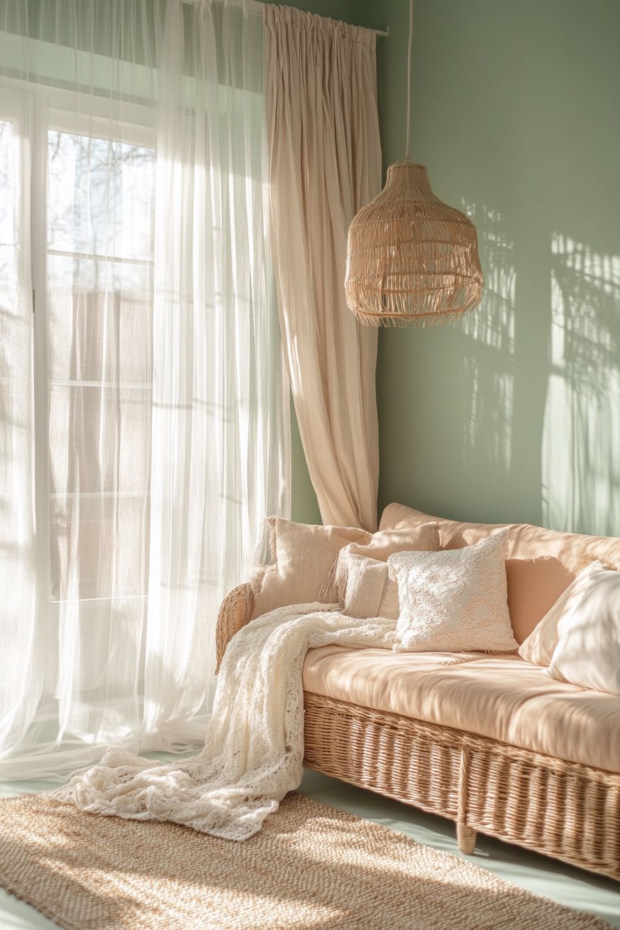
2. Sage Green and Cream
This is what I imagine serenity looks like if it were a living room. The soft sage green walls have this dreamy, almost ethereal quality that instantly makes your shoulders relax, while those creamy white accents feel like clouds floating through the space.
You know how some color combinations just make you breathe deeper? This is one of those. The natural linen textures and maybe a few eucalyptus stems in a simple vase would complete this perfectly, if you’re looking to bring in that spa-like vibe at home.
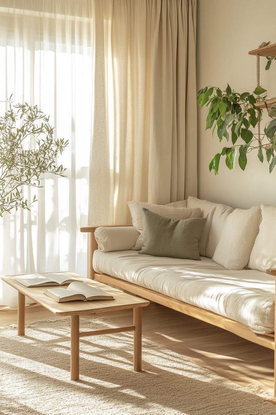
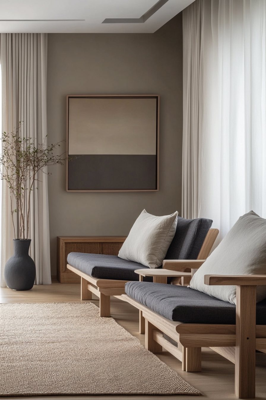
3. Charcoal Gray and Blush Pink
Talk about a power couple! The deep charcoal creates this incredibly chic backdrop that makes everything else in the room look more expensive, while those soft blush pink touches add just enough femininity to keep things from feeling too stark or masculine.
I’m obsessed with how this palette works in both modern and traditional spaces. That dusty rose velvet ottoman or those ballet-pink throw pillows against the charcoal sofa? Pure magic, and it’s a combination that photographs beautifully if you’re into sharing your space on social media.
4. Terracotta and Off-White
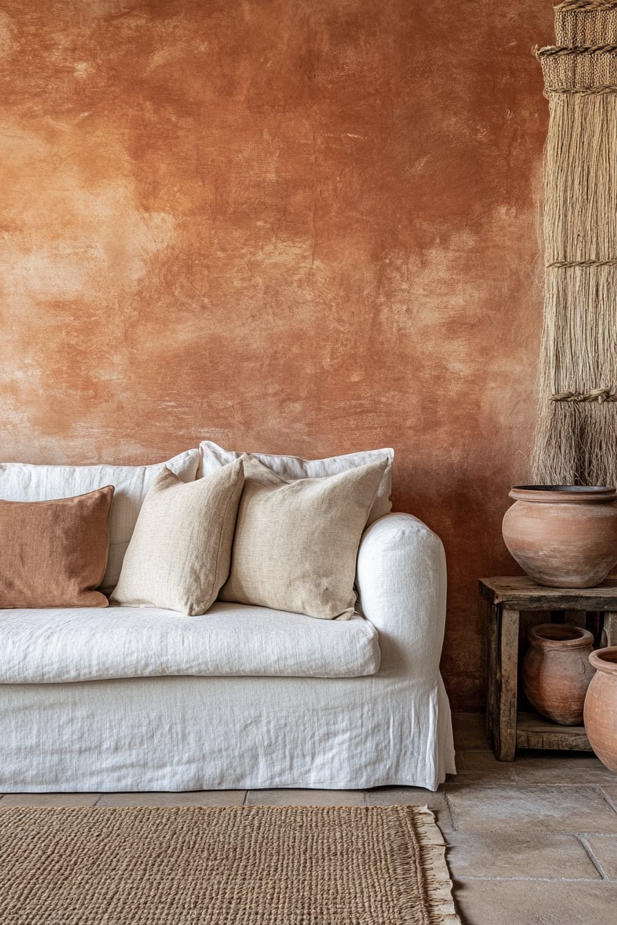
This feels like a warm hug from your favorite Mediterranean vacation spot. The rich terracotta brings all that earthy, sun-baked warmth indoors, while the soft off-white keeps everything feeling fresh and airy rather than heavy.
What’s brilliant about this combo is how it works year-round, you get that cozy autumn feeling in October but it still feels bright and welcoming come spring. Add some natural woven baskets and maybe a few terra cotta planters with trailing greenery, and you’ve got yourself a little slice of Tuscany.
5. Olive Green and Burnt Orange
This combination has serious vintage vibes, like something straight out of a 1970s design magazine but updated for today’s sensibilities. The olive green feels so sophisticated and grounding, while that burnt orange adds this incredible warmth that makes the whole space feel alive.
I love how these colors seem to shift throughout the day as the light changes, sometimes looking more muted and earthy, other times practically glowing. It’s the kind of palette that works beautifully with brass accents and natural wood furniture, especially those mid-century modern pieces everyone’s hunting for at estate sales.
6. Dusty Rose and Deep Plum
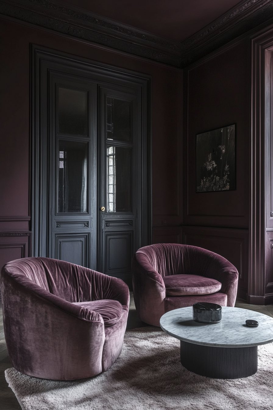
This is romance without the saccharine sweetness, all grown up and incredibly elegant. The dusty rose has this vintage charm that feels both nostalgic and fresh, while that deep plum adds drama and depth that keeps things from feeling too precious.
There’s something almost jewel-like about this combination, especially when you catch it in candlelight or during those golden hour moments. It reminds me of old Victorian sitting rooms, but with a modern twist that doesn’t feel stuffy or overwhelming.
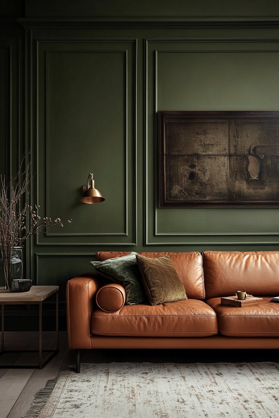
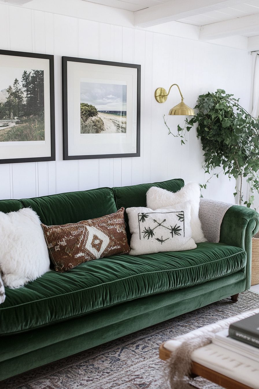
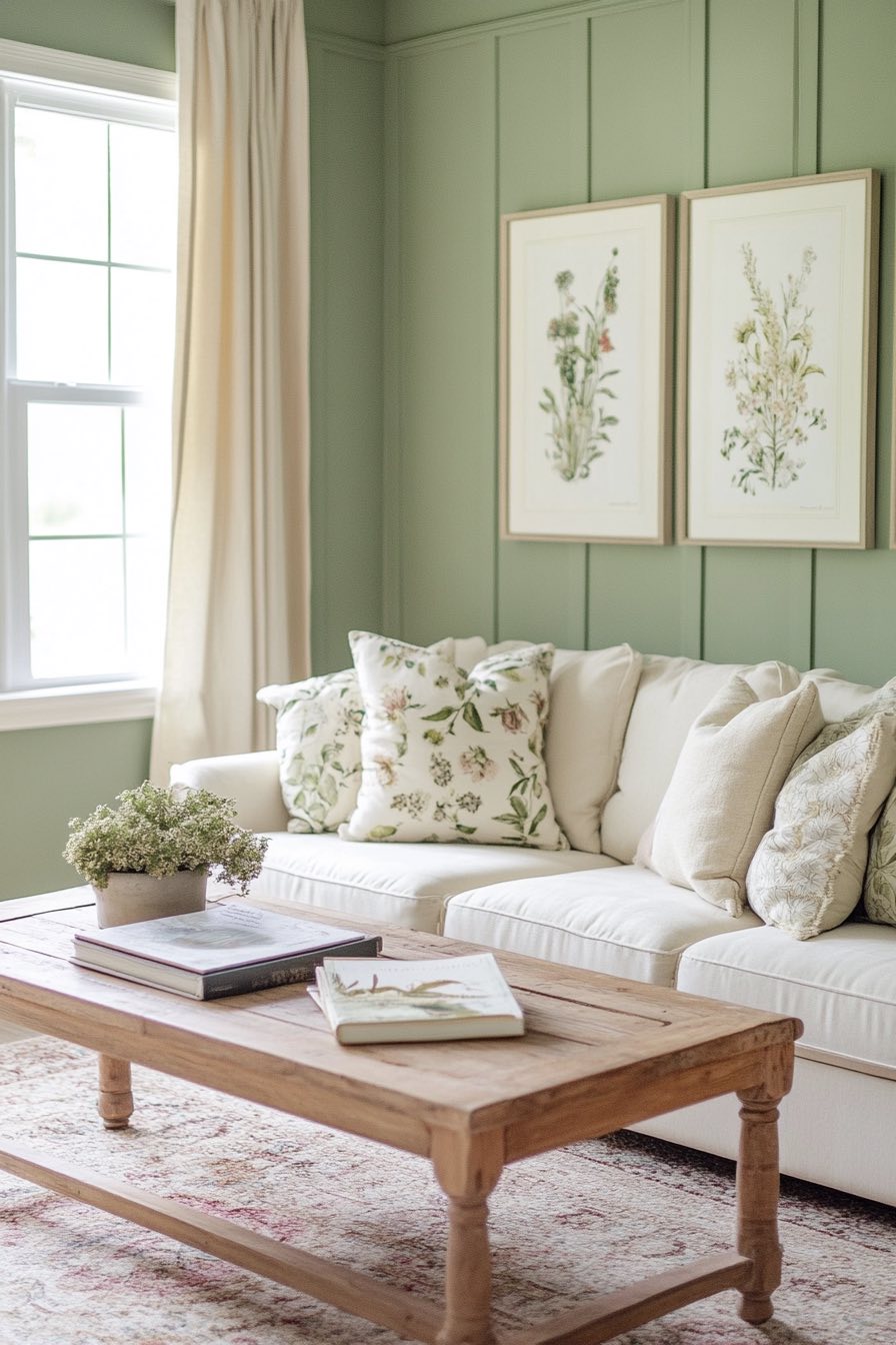
7. Beige and Forest Green
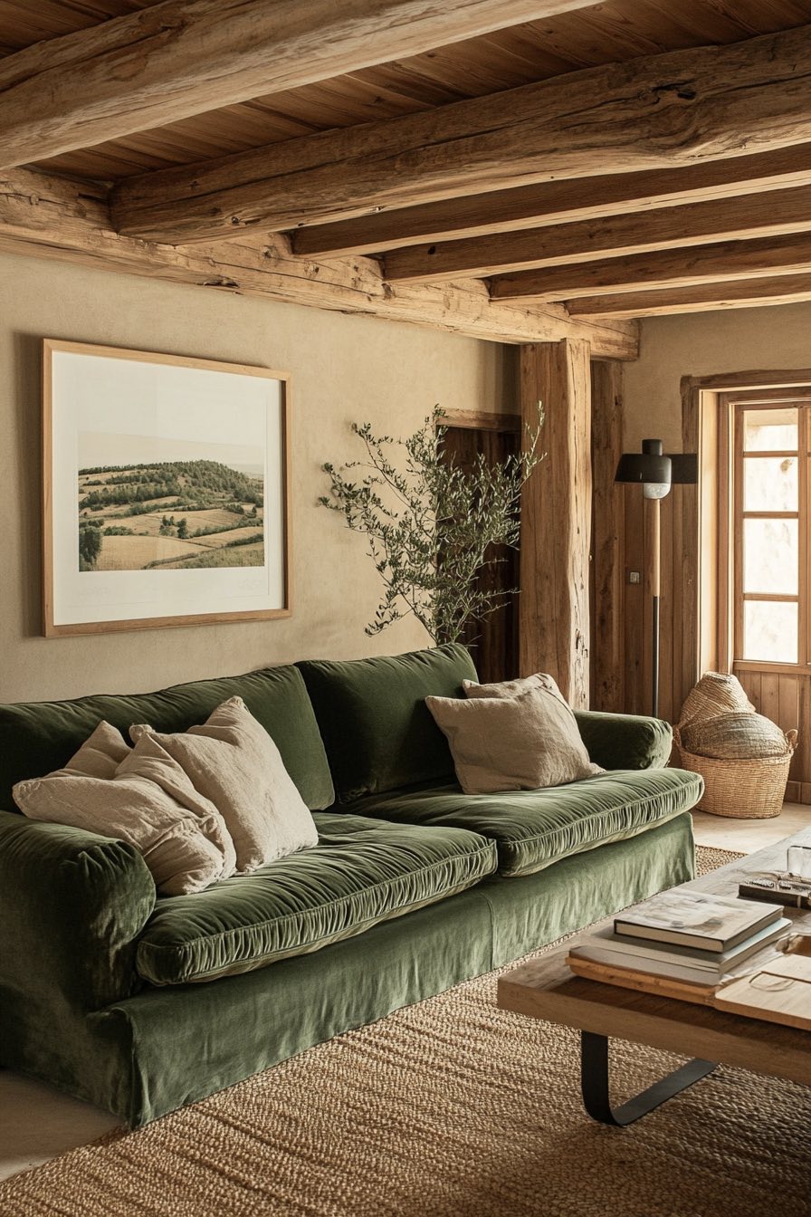
If neutrals had a best friend, it would definitely be this rich forest green. The warm beige creates this perfect, calming foundation while that deep green brings in just enough color to keep things interesting without being overwhelming.
This is one of those combinations that gets better with age, like a fine wine or your favorite leather jacket. Add some natural textures like jute rugs or chunky knit throws, and you’ve got a space that feels both timeless and completely current.
8. Sky Blue and Sandy Beige
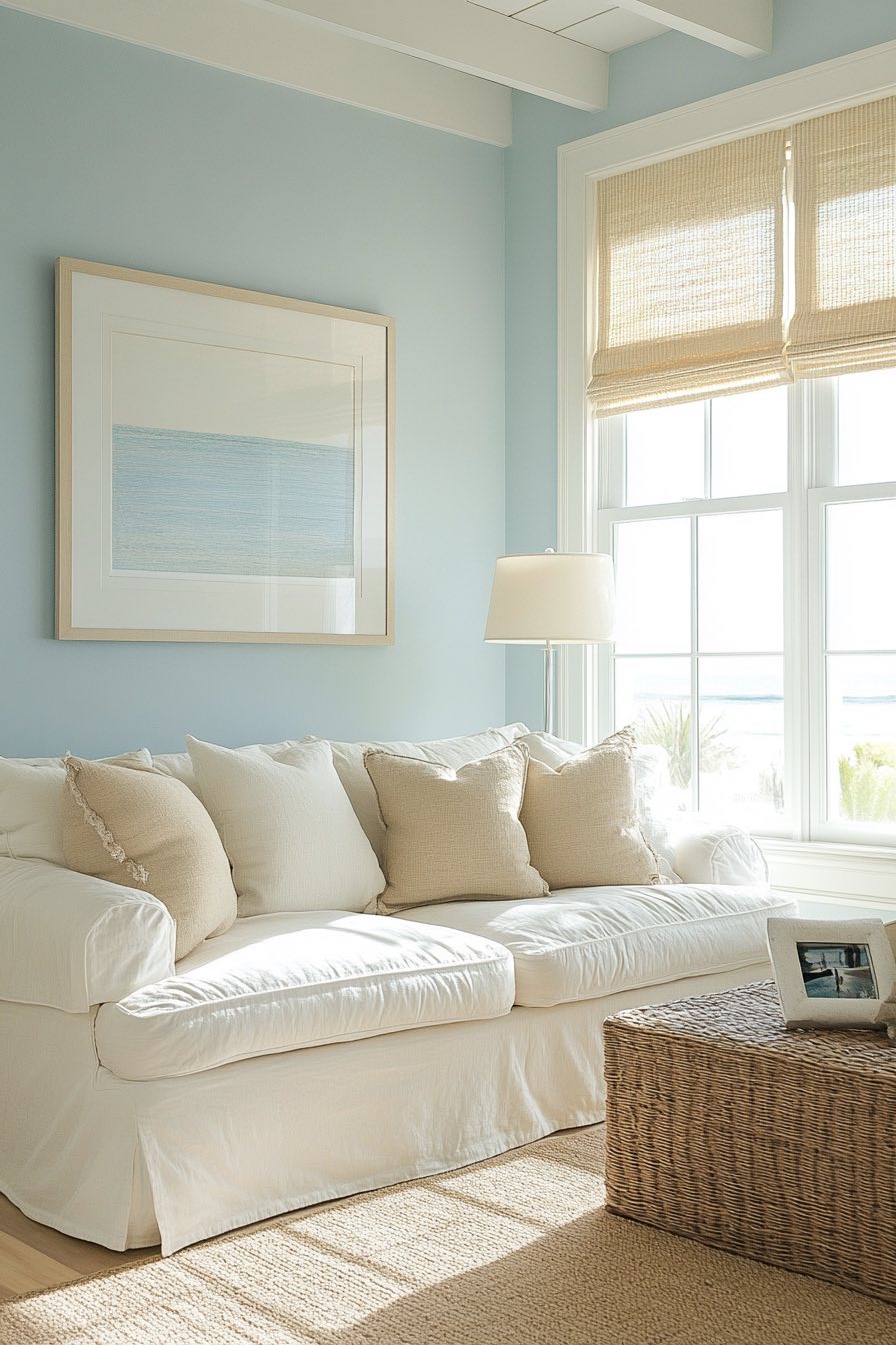
Close your eyes and you can practically hear the ocean waves with this dreamy coastal combination. The soft sky blue brings that endless summer feeling indoors, while the sandy beige grounds everything with its warm, natural earthiness.
What I adore about this palette is how effortlessly relaxing it feels, like you’re perpetually on vacation even when you’re just binge-watching your favorite series. It’s perfect if your living room doesn’t get tons of natural light, since that blue really helps open up the space and make it feel brighter.
9. Black and Gold
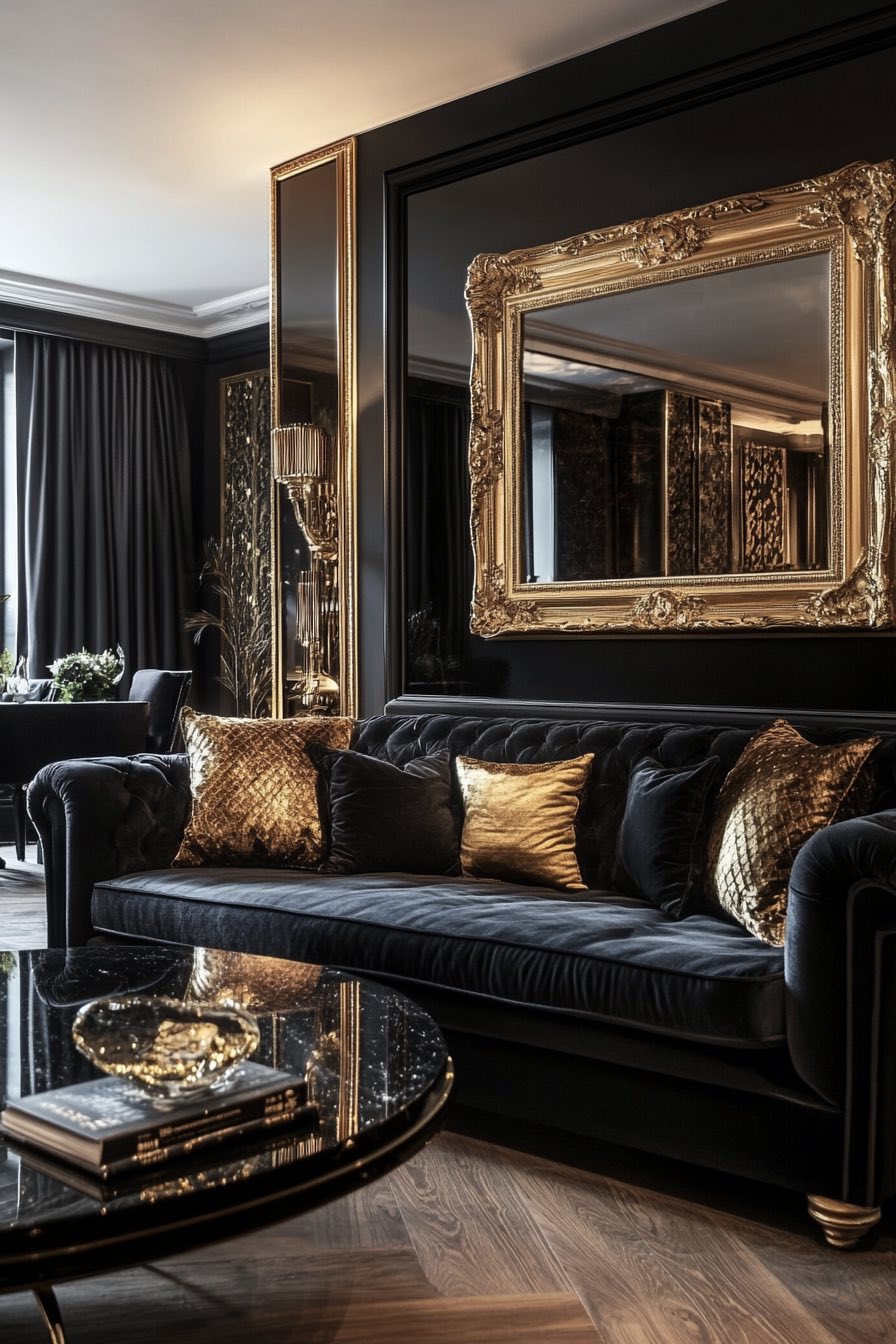
Talk about making a statement! This is luxury distilled into its purest form, where every element feels intentional and impossibly chic. The deep black creates this dramatic backdrop that makes everything else in the room feel like it’s spotlit, while those gold accents add warmth and glamour.
Sure, it might seem intimidating at first, but there’s something so confident about this combination. It’s like wearing a perfectly tailored black dress with gold jewelry, you feel instantly more put-together and ready to take on the world, even if you’re just hosting a casual dinner party.
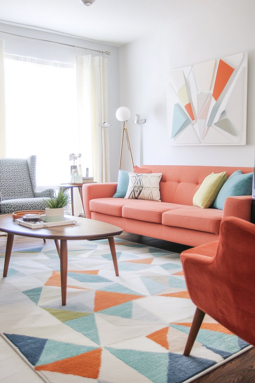
10. Teal and Coral
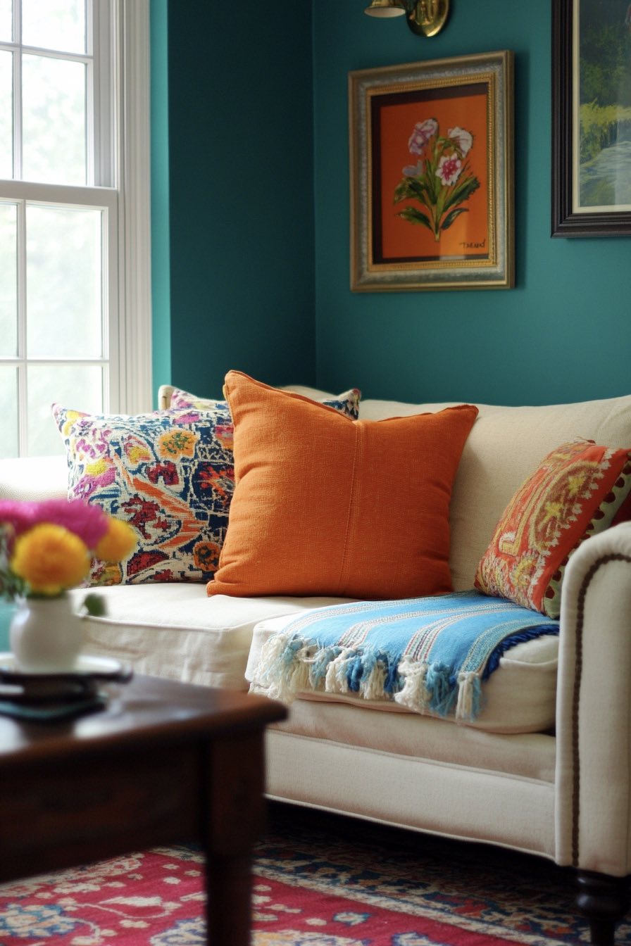
This combo is pure joy in color form, like a tropical sunset that decided to redecorate your living room. The rich teal brings that oceanic depth and tranquility, while the coral adds this vibrant energy that’s impossible to ignore in the best possible way.
What’s amazing is how these colors seem to enhance each other, the teal makes the coral look more sophisticated, while the coral keeps the teal from feeling too serious. It’s like having the best of both worlds, calming and energizing at the same time.
11. Chocolate Brown and Baby Blue
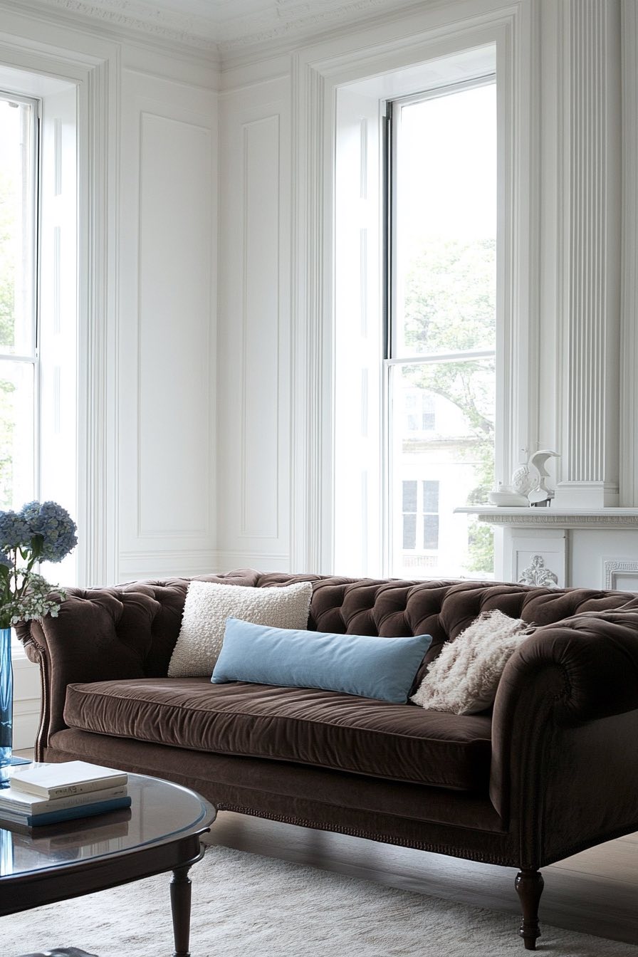
There’s something so comforting about this unexpected pairing, like the grown-up version of your favorite childhood blanket. The rich chocolate brown feels incredibly grounding and luxurious, while that soft baby blue adds this gentle, almost dreamy quality that keeps the space from feeling too heavy.
I love how this combination works in both traditional and contemporary settings. It reminds me of those cozy library reading nooks where you could spend hours getting lost in a good book, especially when you add some warm brass lighting and maybe a soft throw in cream or ivory.
12. White and Emerald Green
This is what happens when classic meets dramatic, and the result is absolutely stunning. The crisp white creates this perfect clean canvas that makes everything pop, while that jewel-toned emerald green adds instant sophistication and personality.
What I find brilliant about this pairing is how it feels both fresh and timeless. It’s like adding a statement emerald necklace to a simple white dress, suddenly everything looks more expensive and intentional. Plus, if you’re nervous about using bold colors, this is a great way to dip your toes in since white is such a safe, familiar base.
13. Mauve and Slate Gray
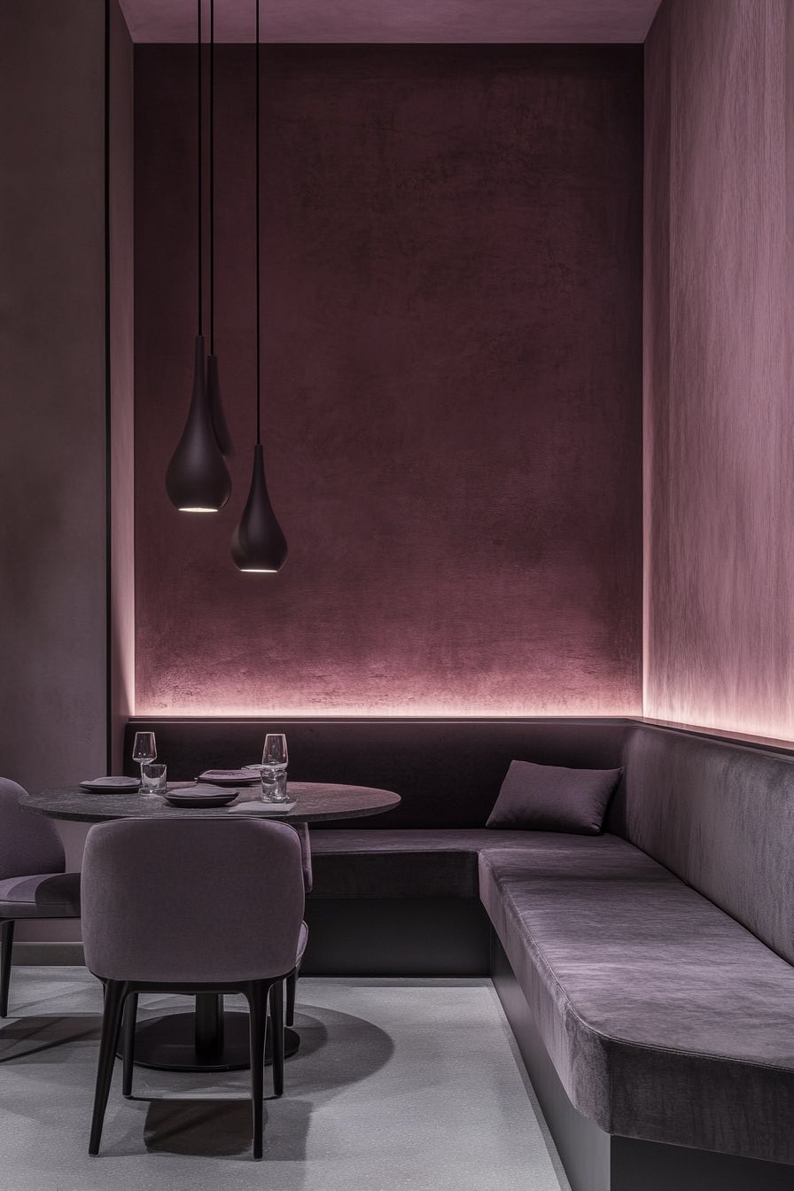
This sophisticated combination feels like it was plucked straight from a European boutique hotel, all understated elegance and quiet luxury. The soft mauve brings this gentle warmth that’s neither too pink nor too purple, while the slate gray adds that perfect modern edge.
There’s something so calming about these muted tones, they create this cocoon-like atmosphere that’s perfect for unwinding after a long day. It’s the kind of palette that photographs beautifully but feels even better in person, especially with some soft lighting and maybe a few touches of brass or copper.
14. Soft Lavender and Silver
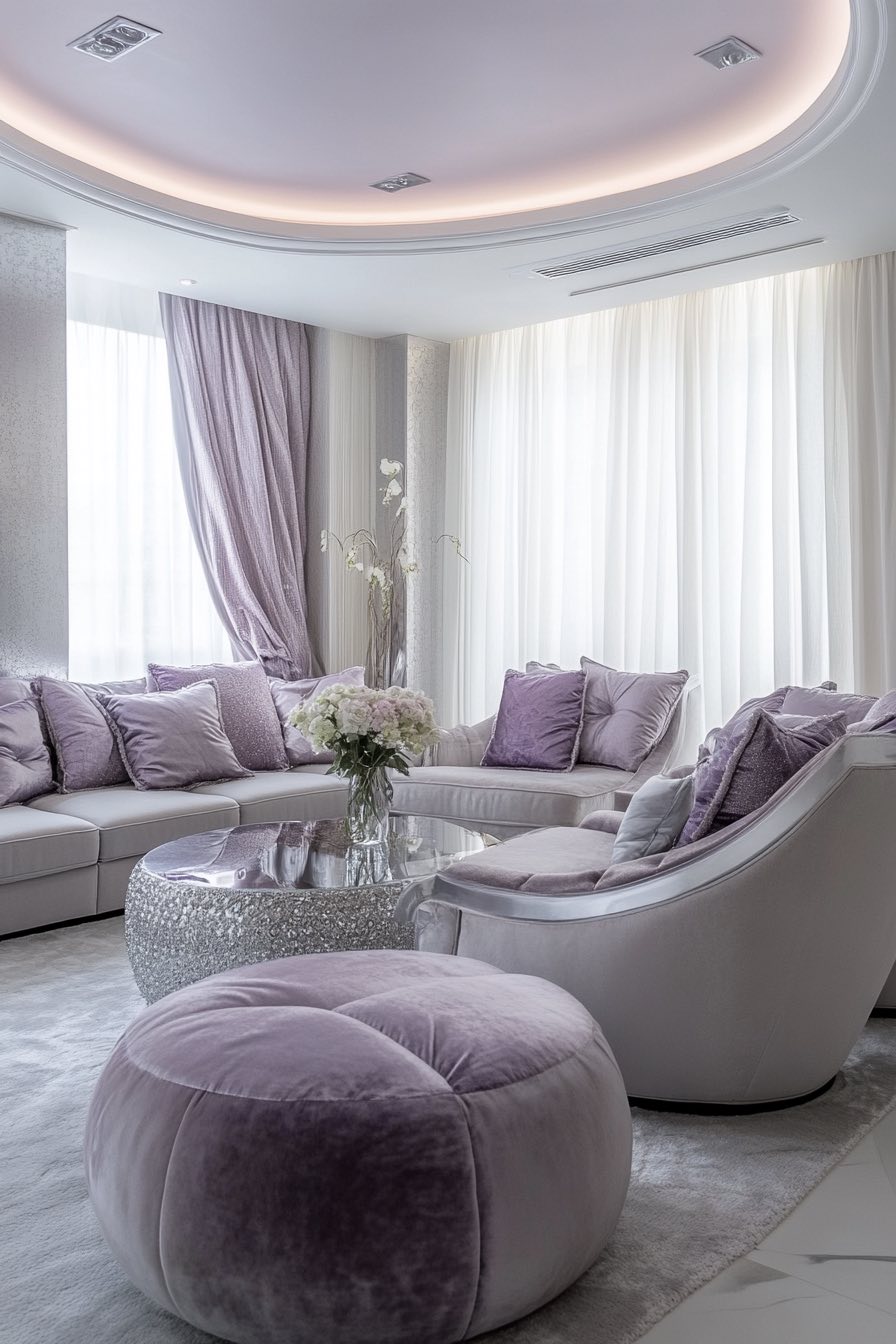
This ethereal combination feels like living inside a cloud, all dreamy and serene with just the right amount of shimmer. The soft lavender brings that spa-like tranquility without being too sweet, while those silver accents add this lovely cool sophistication.
What’s wonderful about this palette is how it changes throughout the day, looking almost celestial in morning light and cozy romantic by evening. It’s perfect if you want your living room to feel like a peaceful retreat from the chaos of everyday life.
15. Taupe and Burgundy
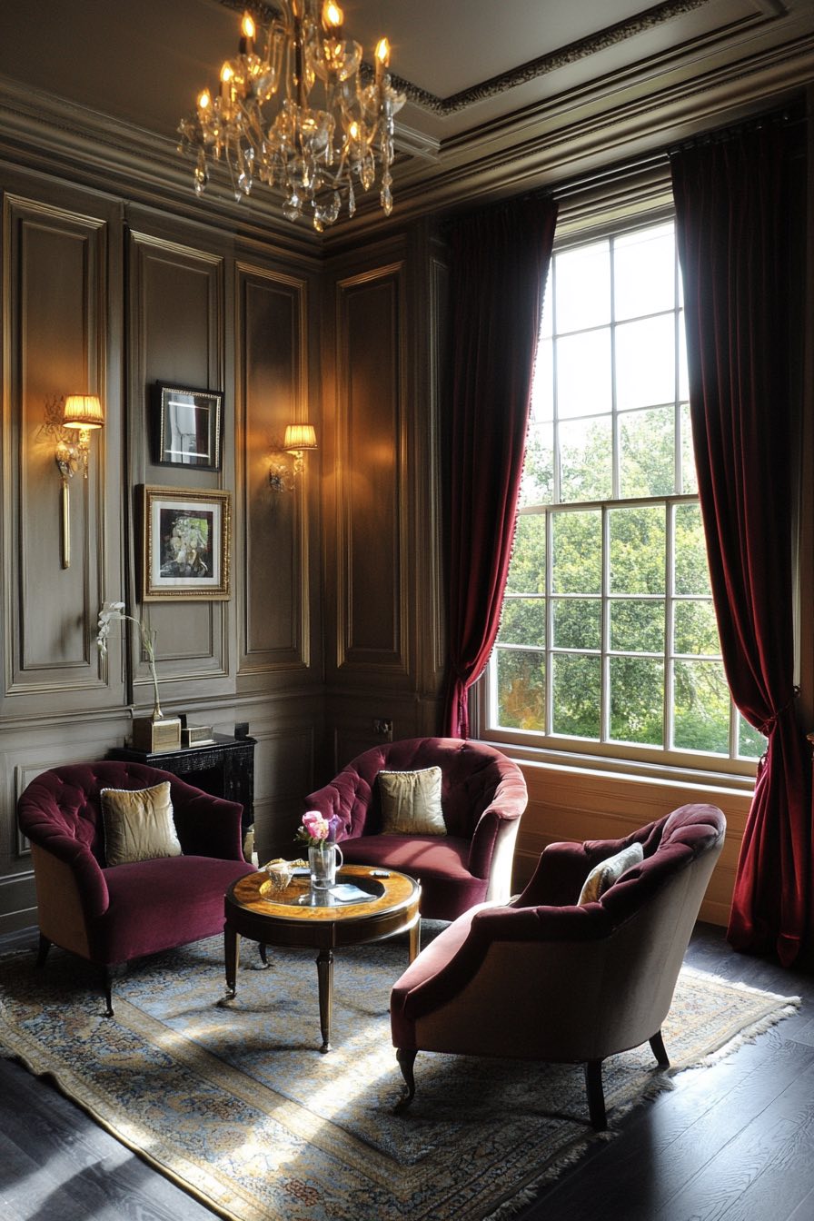
This is autumn in a living room, rich and warm with that perfect balance of neutral sophistication and cozy comfort. The soft taupe creates this beautiful, calming foundation while that deep burgundy adds drama and depth without being overwhelming.
I love how this combination feels both classic and current, like something you’d find in a well-appointed English countryside home but updated for modern living. It’s especially gorgeous with natural textures like wool, leather, and maybe some antique brass accents to tie everything together.
16. Ice Blue and Charcoal
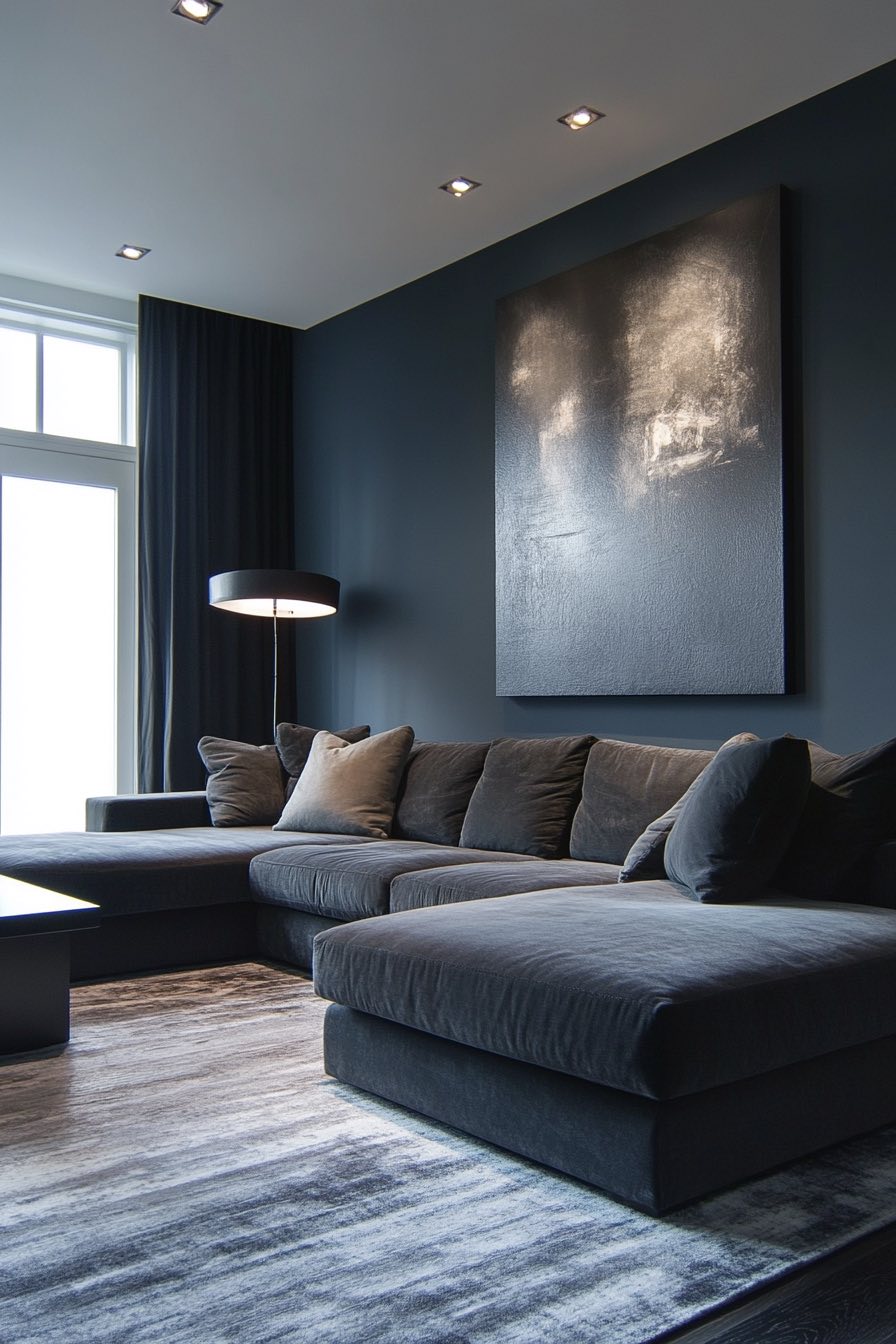
This cool, contemporary combination feels like winter mornings and modern architecture, all clean lines and sophisticated restraint. The pale ice blue brings this refreshing lightness that opens up the space, while the charcoal gray anchors everything with its strong, confident presence.
What’s brilliant about this pairing is how it works year-round but never feels cold or uninviting. It’s like having your own little slice of Scandinavian design philosophy, where less really is more and every element has its perfect place.
17. Warm Gray and Rust
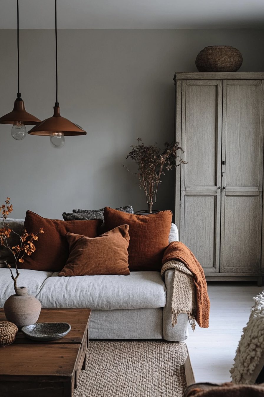
This earthy combination feels like a cozy cabin retreat, all warmth and natural comfort. The soft gray provides this perfect neutral backdrop that’s neither too cool nor too warm, while that rich rust color adds this gorgeous pop of earthy sophistication.
There’s something so grounding about these colors together, they create this sense of being connected to nature even when you’re nestled indoors. It’s perfect with natural materials like reclaimed wood, woven baskets, and maybe some dried pampas grass for that organic, lived-in feeling.
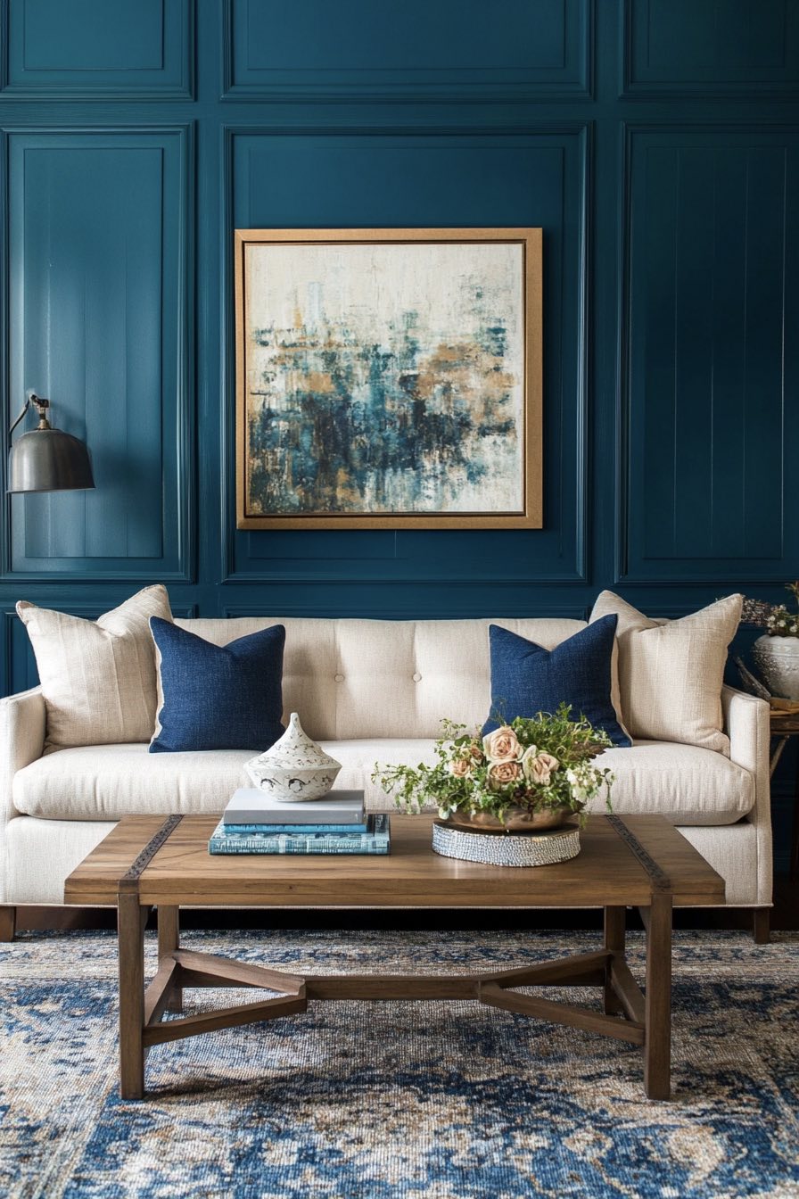
18. Cream and Midnight Blue
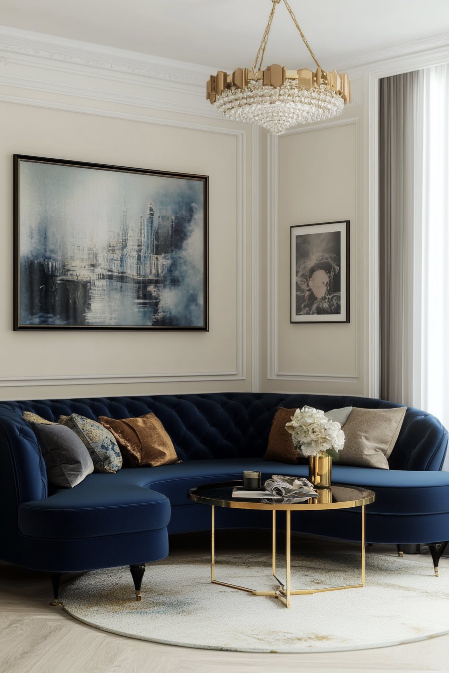
This classic combination feels like luxury wrapped in comfort, where every element seems carefully chosen and beautifully balanced. The soft cream creates this warm, inviting foundation while that deep midnight blue adds drama and sophistication without feeling heavy.
What I adore about this pairing is how it works in any style of home, from traditional to ultra-modern. It’s like wearing a crisp white shirt with perfectly tailored navy pants, always appropriate, always elegant, and always makes you look put-together effortlessly.
19. Pistachio and Ivory
This delicate combination feels like spring morning light filtering through new leaves, all fresh and gentle and full of promise. The soft pistachio green brings this subtle color that’s barely there but makes such a difference, while the ivory keeps everything feeling light and airy.
There’s something so peaceful about these pale, muted tones, they create this sense of calm that’s perfect for busy lives. It’s like having a constant gentle reminder to slow down and breathe, especially beautiful with some natural linen textures and maybe a few white orchids.
20. Greige and Navy
This sophisticated pairing is like the perfect capsule wardrobe for your living room, timeless, versatile, and always looks expensive. The warm greige gives you that perfect neutral that works with everything, while the navy adds that classic depth and richness.
What’s genius about this combination is how it never goes out of style but never feels boring either. It’s the kind of palette that lets your furniture and accessories be the stars while providing this beautifully balanced backdrop that makes everything look more intentional.
21. Coral and Aqua
This vibrant combination is like having perpetual summer vacation vibes in your living room, all energy and joy and tropical warmth. The coral brings this gorgeous warmth that feels like sunset skies, while the aqua adds that refreshing coolness of ocean waters.
What I love is how these colors seem to make each other more beautiful, the coral looks richer next to the aqua, and the aqua feels more vibrant against the coral. It’s like they were made for each other, perfect for anyone who isn’t afraid of a little color in their life.
22. Mustard and Ash Gray
This unexpected pairing feels like modern vintage, where retro charm meets contemporary sophistication. The rich mustard yellow brings this gorgeous warmth and personality, while the ash gray provides this perfect cool counterbalance that keeps things from being too intense.
There’s something so confident about this combination, it’s not afraid to be noticed but it’s sophisticated enough to work in grown-up spaces. It reminds me of those perfectly curated mid-century modern homes where every piece looks like it was chosen by someone with impeccable taste.
23. Earthy Brown and Pale Pink
This gentle combination feels like dawn breaking over desert landscapes, all soft and warm and naturally beautiful. The rich brown brings this incredible grounding quality, while that whisper of pale pink adds just enough softness to keep things from feeling too masculine or heavy.
What’s lovely about this pairing is how organic and effortless it feels, like these colors were always meant to be together. It’s perfect with natural textures like linen, jute, and unfinished wood, creating this sense of being connected to the earth even when you’re indoors.
24. Seafoam Green and Peach
This dreamy combination feels like a watercolor painting come to life, all soft edges and gentle beauty. The seafoam green brings this calming, oceanic quality that instantly relaxes you, while the soft peach adds warmth and sweetness without being overwhelming.
There’s something so soothing about these colors together, they create this sense of being somewhere peaceful and beautiful, maybe a cottage by the sea or a garden pavilion. It’s perfect if you want your living room to feel like a gentle escape from the everyday world.
25. Mocha and Vanilla
This delicious combination feels like your favorite coffee shop in color form, all warmth and comfort and familiar luxury. The rich mocha brown creates this incredible depth and coziness, while the soft vanilla keeps everything feeling light and balanced.
What I adore about this palette is how it makes every day feel a little more indulgent, like you’re constantly wrapped in cashmere or sipping something delicious. It’s especially beautiful with natural textures and maybe some brass or copper accents to add that extra touch of warmth.
26. Blue-Gray and Ochre
This sophisticated combination feels like an artist’s studio, all creative energy and thoughtful restraint. The blue-gray brings this perfect cool neutrality that’s more interesting than plain gray, while that rich ochre adds warmth and earthiness with an almost vintage quality.
There’s something so balanced about these colors together, they create this sense of being both modern and timeless. It’s like having the best of both worlds, contemporary enough to feel current but with enough character to never feel generic or boring.
27. Maroon and Tan
This rich combination feels like a private gentleman’s club or a cozy library, all warmth and traditional elegance. The deep maroon brings this gorgeous drama and sophistication, while the soft tan provides this perfect neutral balance that keeps things from feeling too intense.
What’s wonderful about this pairing is how it ages beautifully, like fine leather or aged whiskey. It’s the kind of palette that gets more comfortable and more beautiful over time, especially with natural materials and maybe some warm brass lighting to complete the look.
28. Blush and Olive
This unexpected pairing feels like modern romance meets natural sophistication, all gentle and earthy with just the right touch of color. The soft blush brings this barely-there warmth that’s feminine without being precious, while the olive green adds this gorgeous depth and connection to nature.
There’s something so fresh about these colors together, they feel current and of-the-moment while still being timeless enough to love for years. It’s perfect with natural textures and maybe some gold accents to tie everything together beautifully.
29. Canary Yellow and Cool Gray
This energizing combination feels like sunshine on a cloudy day, all brightness and optimism balanced with sophisticated restraint. The cheerful canary yellow brings this incredible energy and happiness, while the cool gray keeps everything grounded and prevents it from being overwhelming.
What I love about this pairing is how it can instantly lift your mood, it’s like having perpetual good lighting that makes everything and everyone look better. It’s perfect if your living room needs a little more energy and positivity, especially during those long winter months.
30. Camel and Deep Teal
This sophisticated combination feels like luxury travel and beautiful hotels, all rich textures and carefully chosen colors. The warm camel brings this gorgeous richness that feels both modern and timeless, while that deep teal adds drama and depth with a jewel-like quality.
There’s something so confident about these colors together, they create this sense of being well-traveled and worldly without trying too hard. It’s perfect with brass accents and rich textures like velvet or leather, creating a space that feels both comfortable and incredibly stylish.